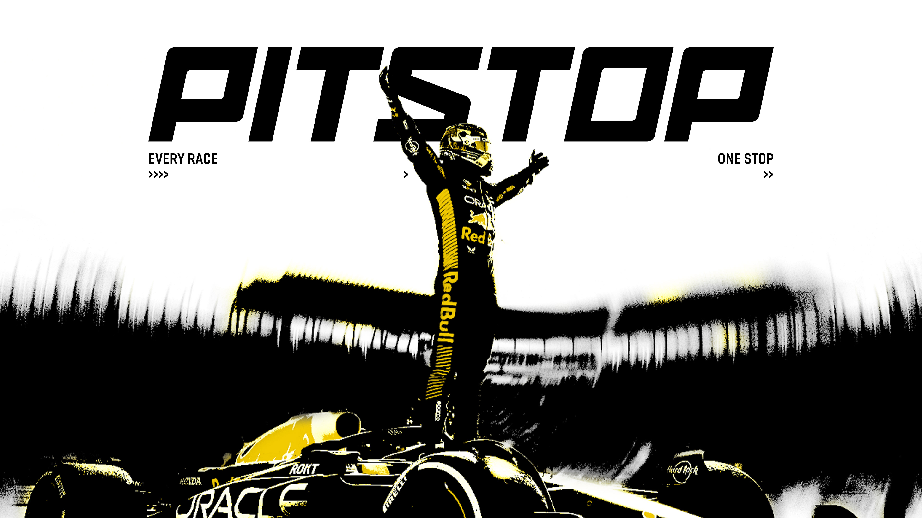
PITSTOP
A Racing Publication
OBJECTIVE I
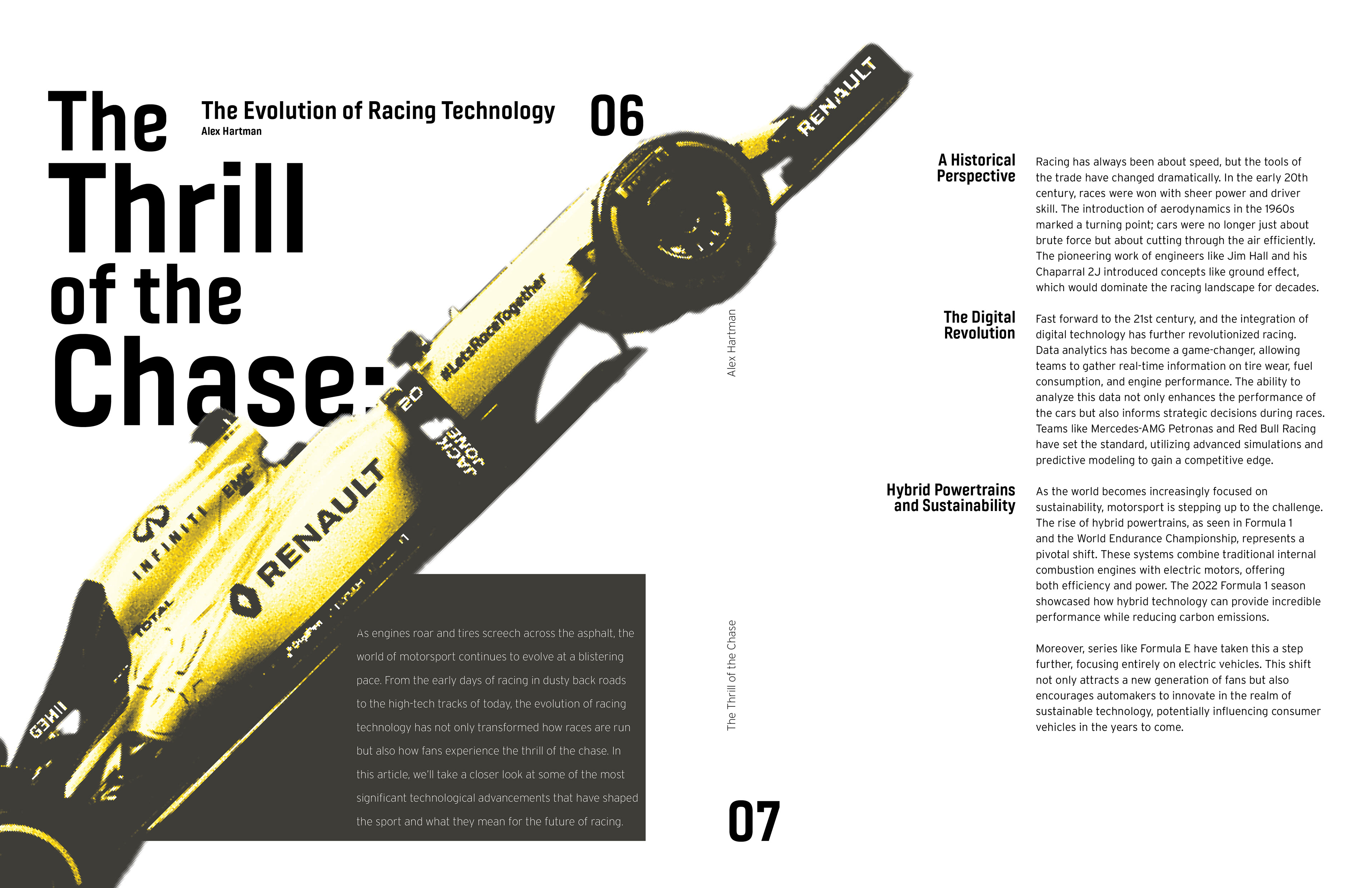
Create a wordmark with the purpose of branding a racing publication, targeted at all racing fans at all levels of interest. The brand image can be reduced to one core visual identity:
PITSTOP is an adrenaline fueled, thrilling immersion that propels readers into the high-octane world of racing.
DESIGN DEVELOPMENT
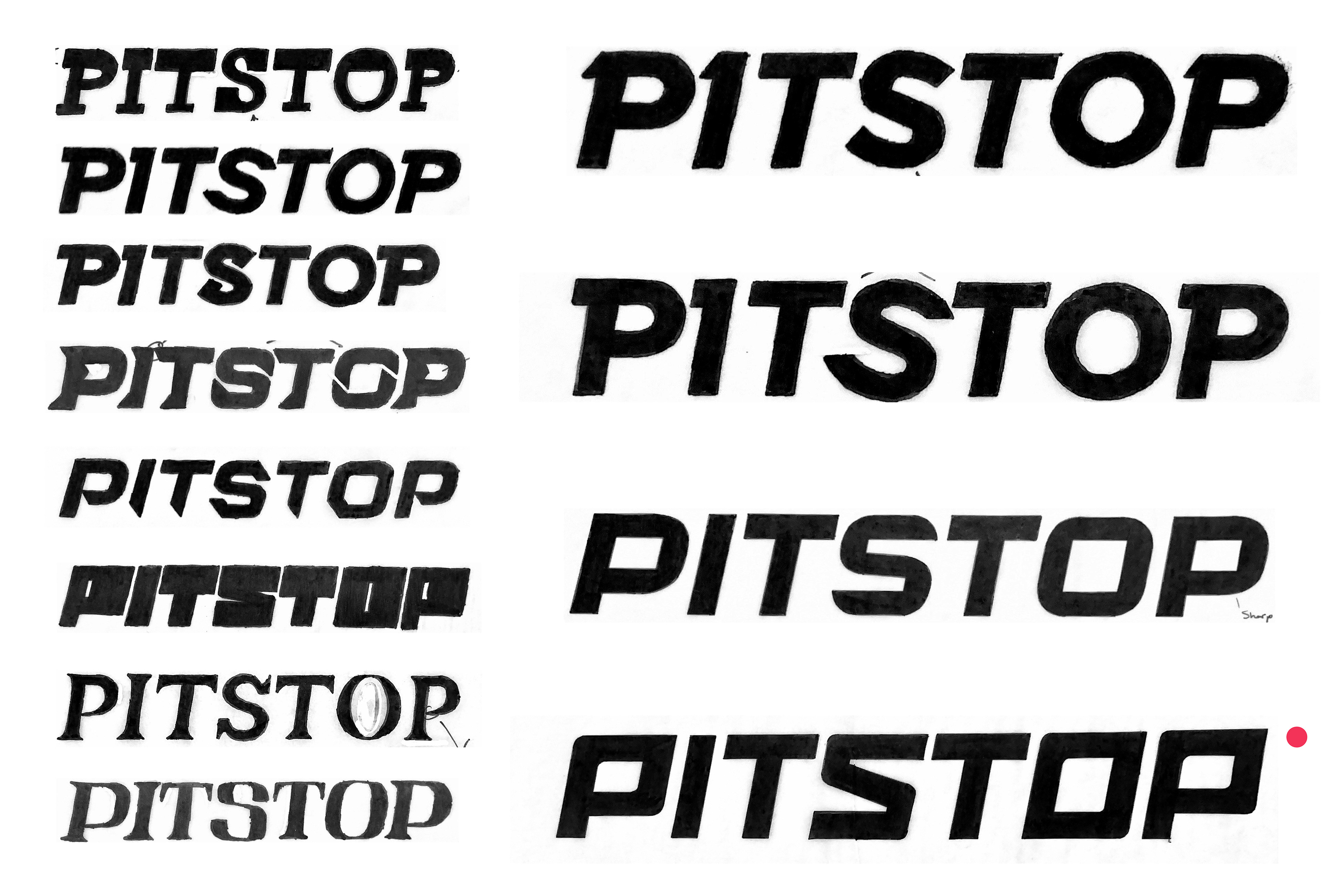
The design development began with many visual directions to express the multifaceted racing culture. The exploration was sparked through researching and building upon various typefaces including, but not limited to Kallisto, Produkt, and Nexa_FF.
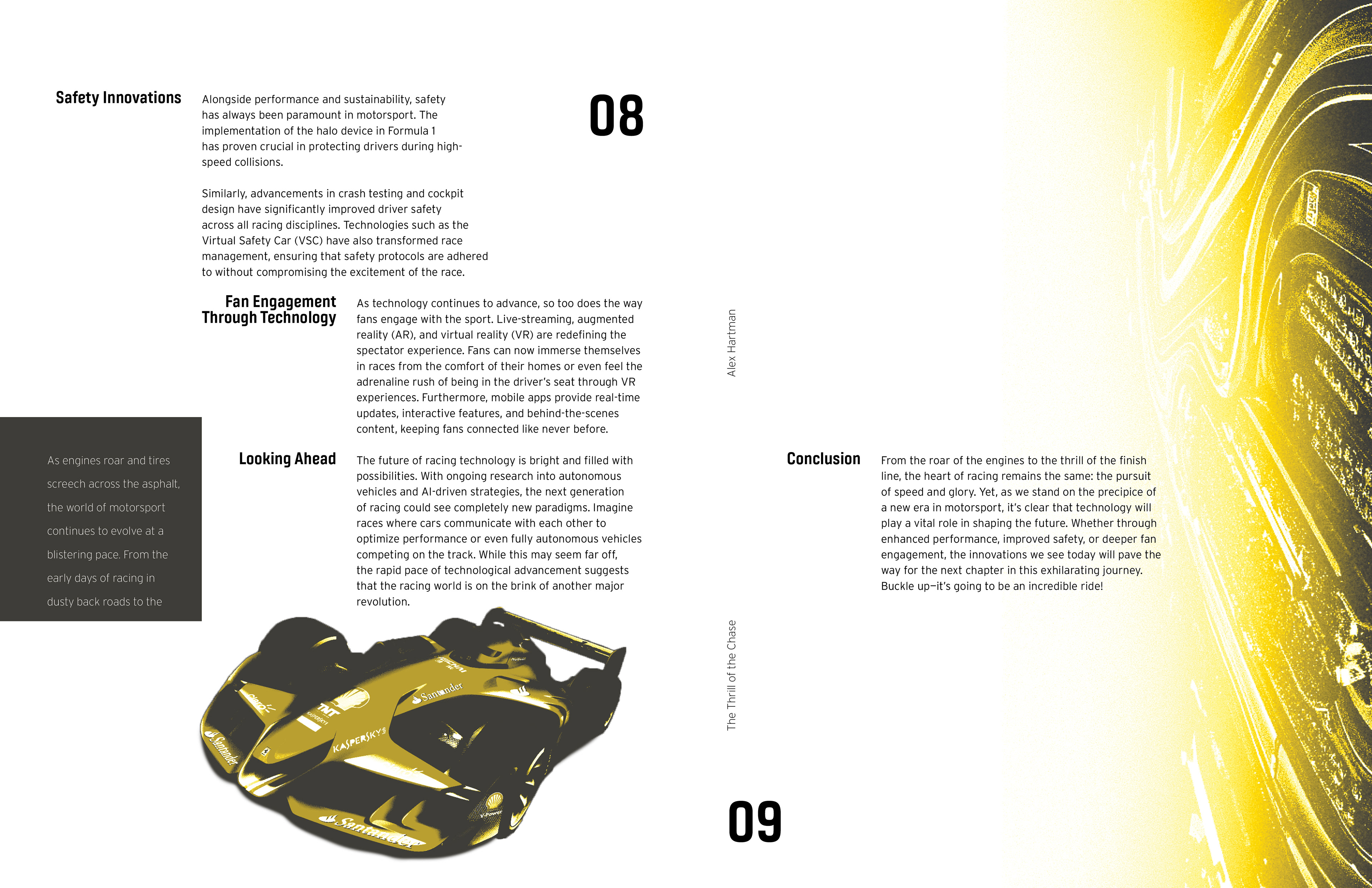
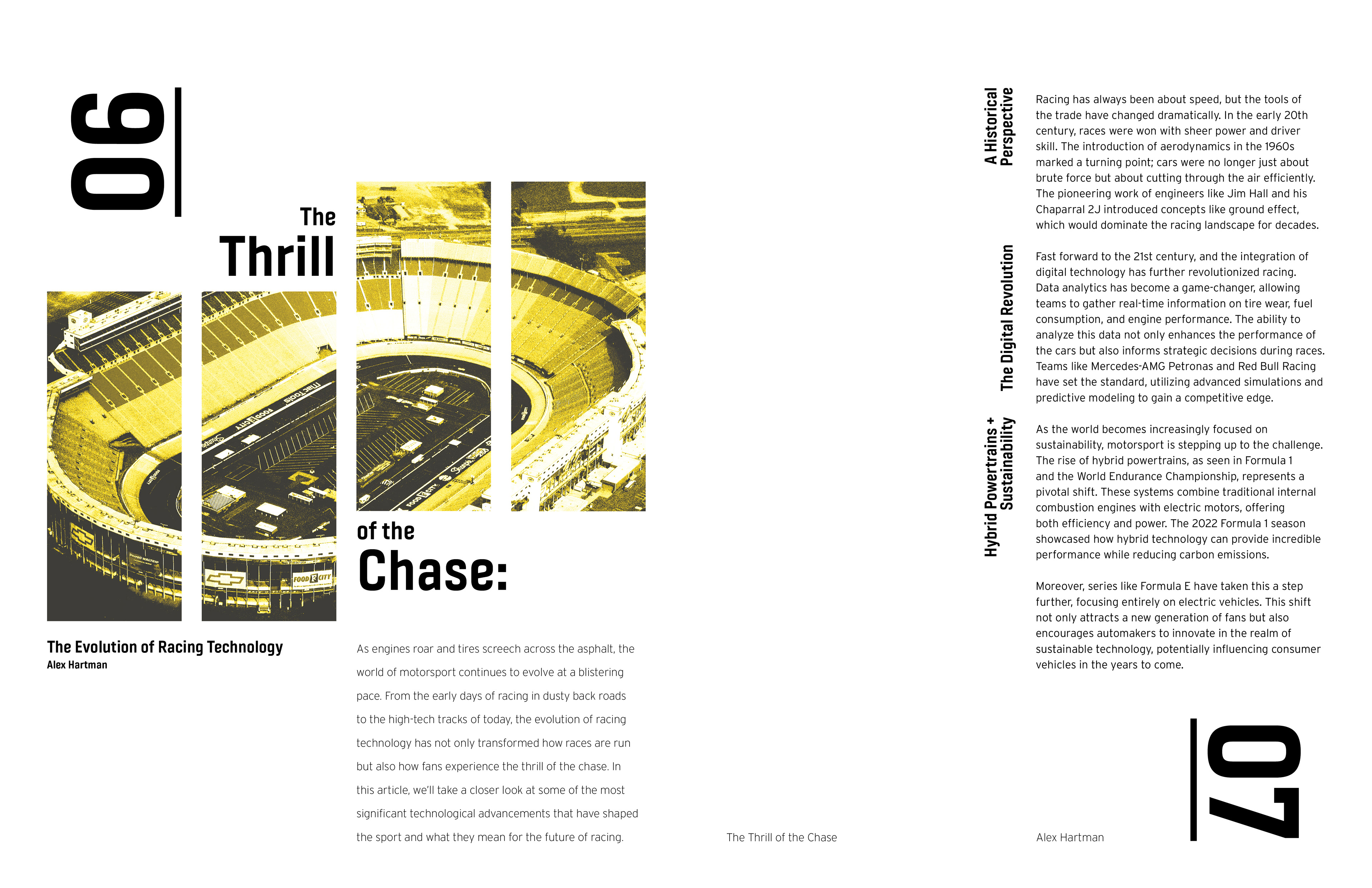
Through refinement, the design became more streamlined into something that felt fast, athletic, and bold. All of these features reflect aspect of the sport and the feeling that it evokes.
Through refinement, the design became more streamlined into something that felt fast, athletic, and bold. All of these features reflect aspect of the sport and the feeling that it evokes.
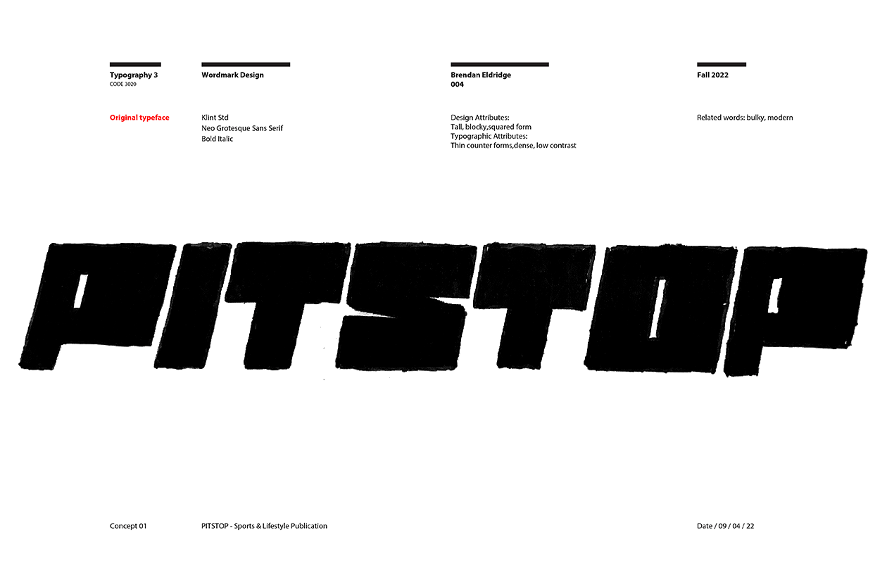
FINAL WORDMARK

The final logo is a polished rendering of the selected sketch, with calculated curves and angles. A wordmark that would stand as the stylist and visual basis for a much larger brand to grow out of, becoming the exhilarating, weekly read: PITSTOP.
OBJECTIVE II
Take the wordmark and visual story that is PITSTOP and develop a full publication brand, exploring the different avenues, topics and themes that each article could cover. Build upon the design choices made in the wordmark to create pages of typography and image that all contribute to the greater brand image and relate to it's initial core identity.
DESIGN ITERATIONS
FINAL PUBLICATION
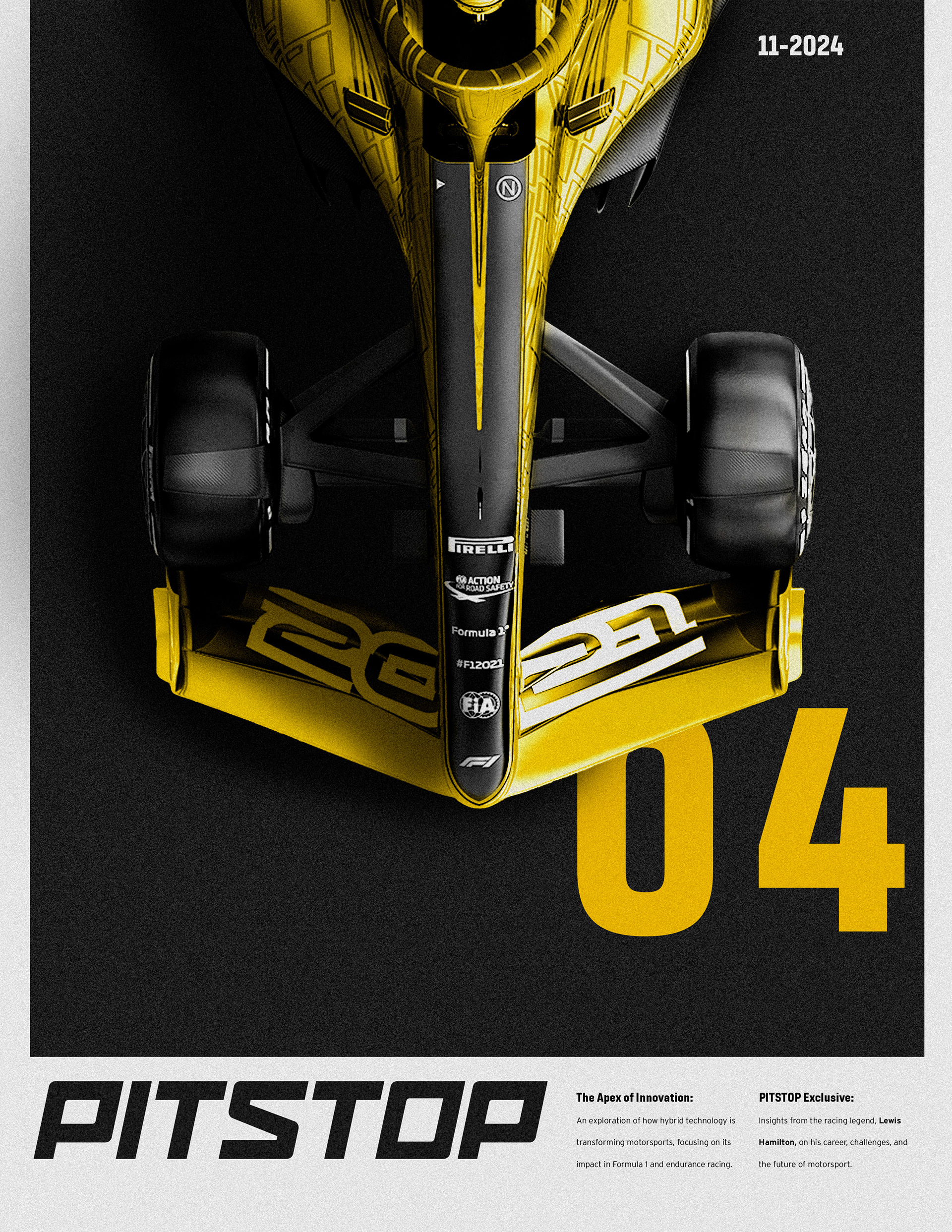

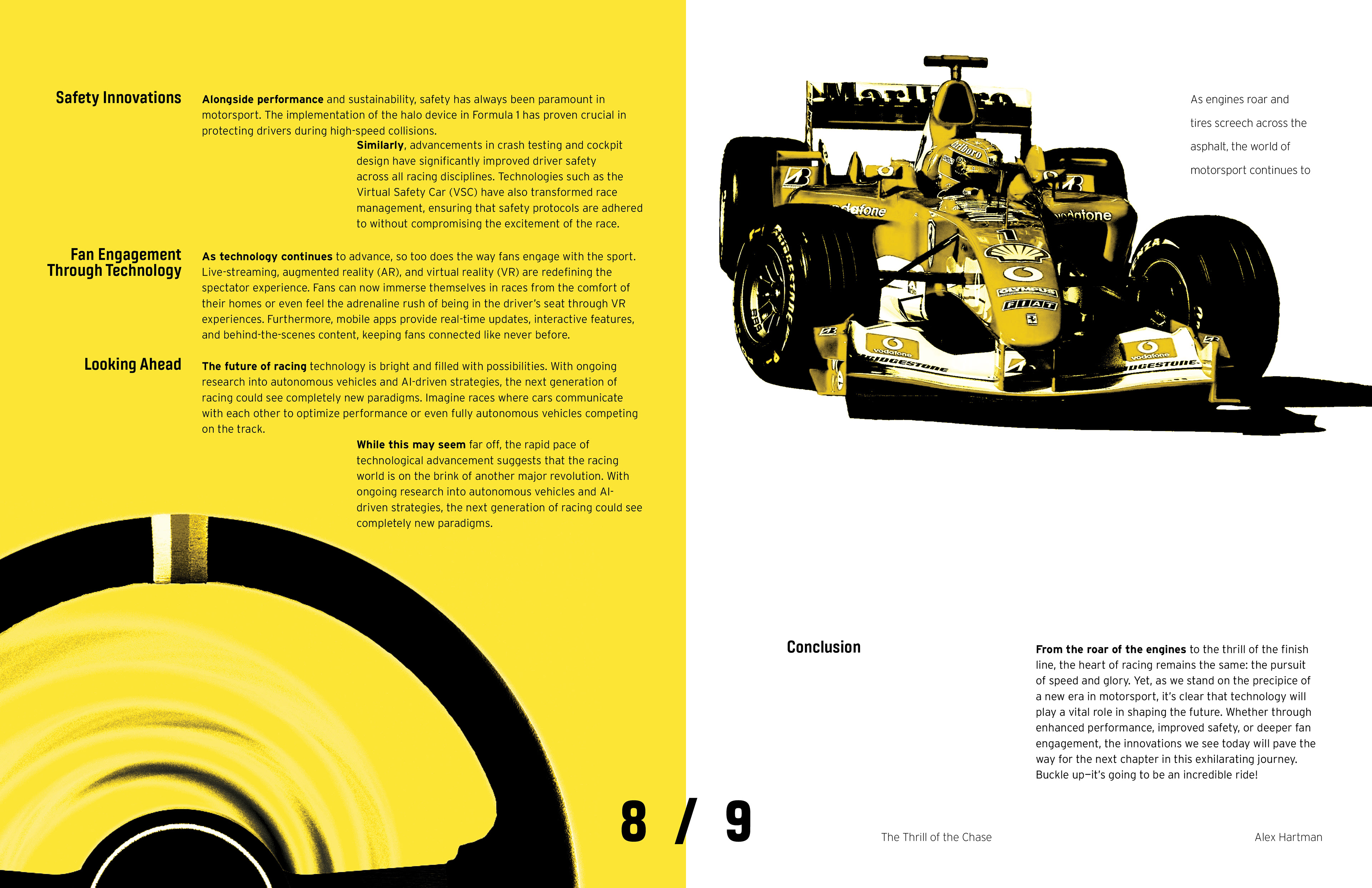
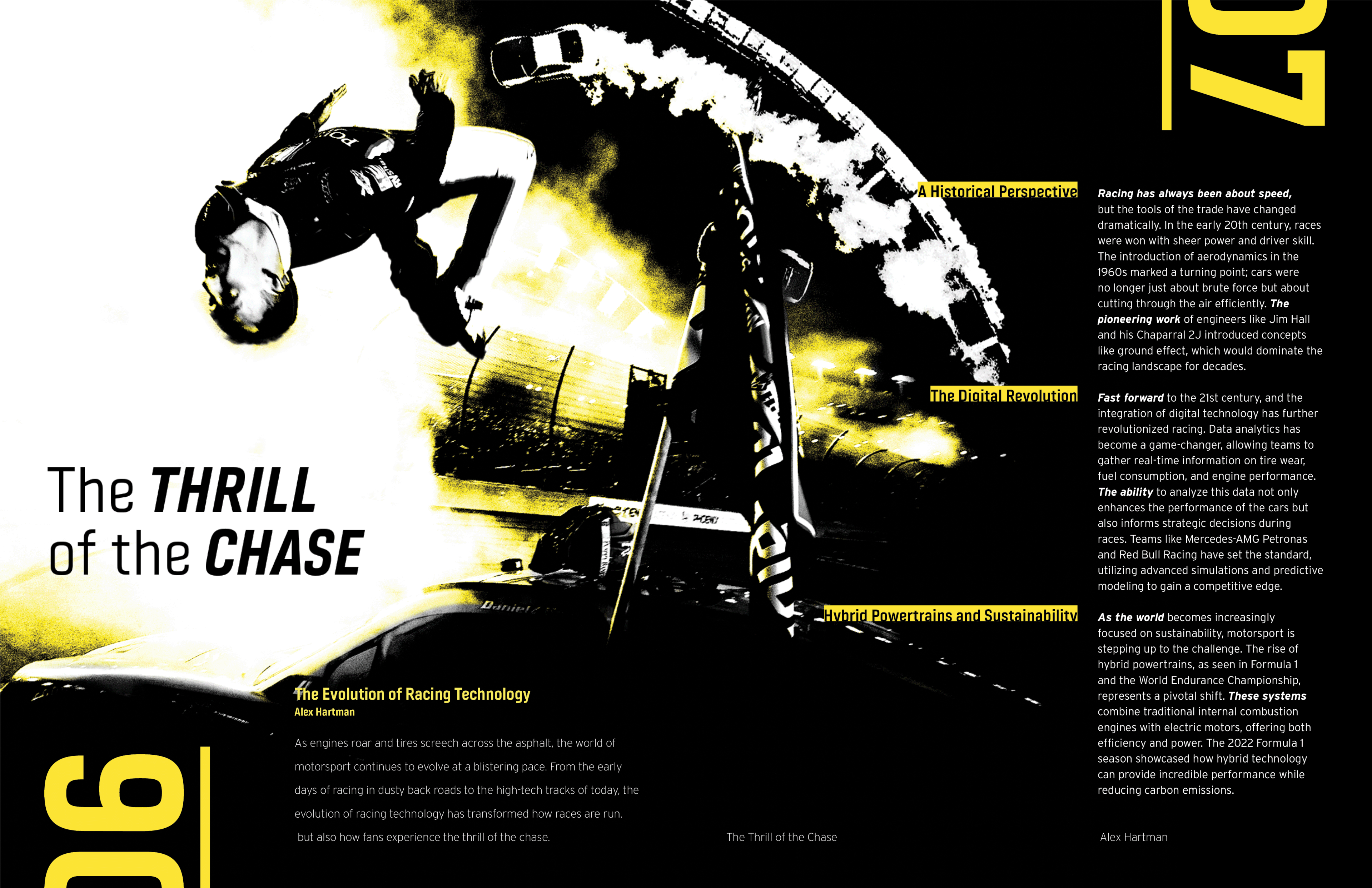
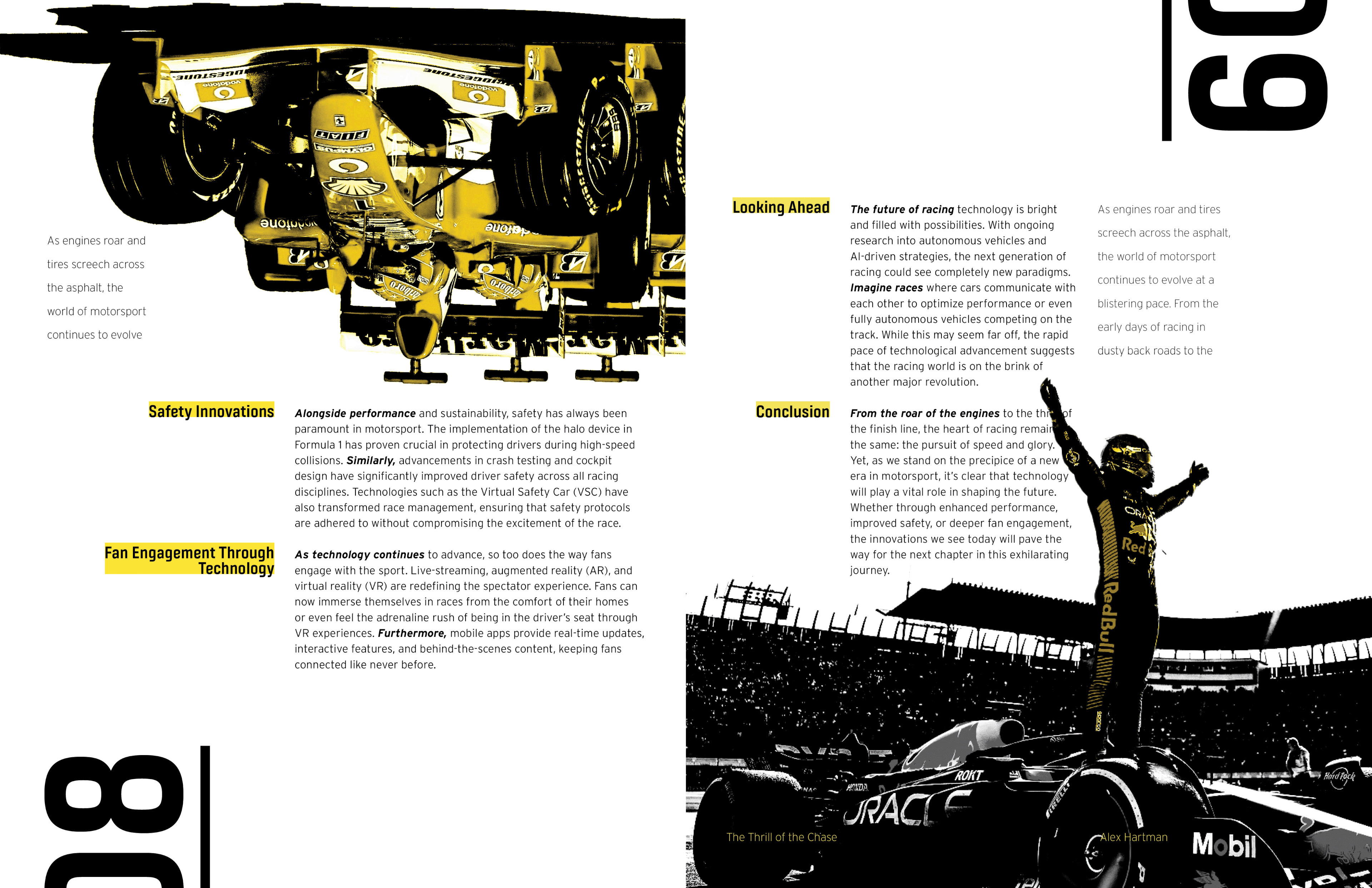
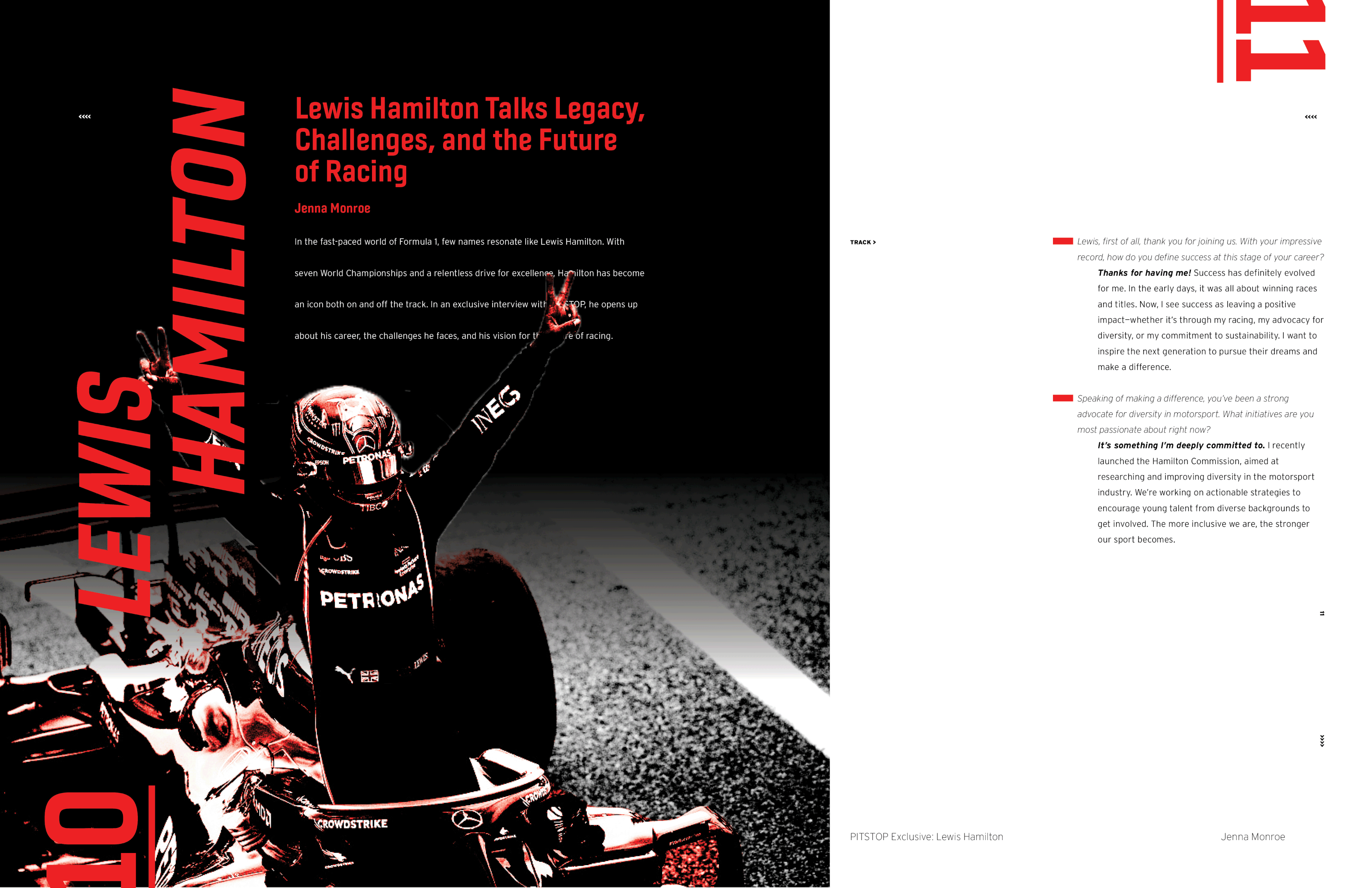
The final publication uses both exciting imagery and typography to form something with a sense of speed and exhilaration, inviting all fans of racing to jump into the thrill of it all and stay updated on the fastest sports in the world.
PUBLICATION WEB ADVERTISEMENT